LNT Bea
LNT Bea Regular


About the typeface:
They crawl, jump, swim, gaze, bite, float, dig and pace… In LNT Bea animals are captured in motion, alive and animated, while they inhabit the spaces of letter-shapes and create magnificent Baroque typography. When I started designing this typeface I was wondering how animals could participate in typography? How could I represent animals following the ecofeminist principles of care ethics?
In search of responses to my own questions, I first dived into past examples of lettering and typography. I marvelled once again at pages of Medieval bestiaries and ornamented initials. Besides my amusement with the fascinating style of Medieval illustrations, I noticed an attitude of horror and struggle towards the animal-ness. Writer Olga Tokarczuk describes best what I read from the images, in her passage about animal suffering: “Animals don’t know consolation or relief, because there is no resolution waiting for them. They have know understanding. They don’t own their body… Animal suffering is absolute, total.”(1) Beside the struggling animal, we see the struggling human, often in conflict with the animal, often portrayed as the weaker one. At this time in history humans are already in struggle with nature, yet they are not yet the masters of it.
As printing comes along in the fifteenth century, animated letters disappear from the repertoire of most printers. While symbolic floral patterns——however reduced to decorative elements in initials and border decorations——flourish on, animals only appear in rare, sporadic examples. Some initials with bucolic scenes, a painter’s signature crawling with insects (I think it was a joke!)(2) and a magnificent etched alphabet with mollusc-motives and bird-heads(3) appear, but no consistent presence can be established.
With the new fashion of ornamented typography, the animal makes a comeback in the nineteenth century. We see it in one of Pouchée’s exuberant alphabets, and in the standard collections of clichés. However, this animal was cut of a different cloth metal than its Medieval counterpart. It’s instrumentalized, subjugated, monetized, capitalized. The very reason for cutting animals in type and ornaments was to pair them with sales advertisements. Animal was no longer horrifying but desirable, no longer symbolic but commodity.
Reviewing my conclusions and observing the beasts in my sketches, I understood that I wanted to bring back the animal-ness that animals deserve in their representation. I wanted to see animals as they were, scary or scared, cute and dangerous, friendly or hungry, resting or running. I wanted to see animals do. I wanted them animated. I wanted them bestial.
In Leiden one may visit the Dutch biodiversity center Naturalis. I went there to make the very first animal drawing sketches for this project. There is a permanent exhibition titled “Life”. As one walks through the rooms, one walks into a bestial manifestation from different landscapes and habitats. Even though the animals——being taxidermy animals——are static, the scenography is in a constant flux, pulling one along into an ever-growing admiration for life on Earth. This sensation of Baroque wonder was the one that sparked the final design idea for LNT Bea: a typeface in constant animated bestial flow.
The letter shapes of LNT Bea are based on Saggi, a revival of Nicholas Kis’s baroque letters. The Saggi project was initiated by Géza Sipos, and the font is collaboratively designed by Géza and myself. Saggi is a text typeface with an extensive character set and open type features, ideal for long reads and advanced typography. This makes LNT Bea and Saggi an ideal combination.
–––––––––––––––––––––
Olga Tokarczuk: “Állatmaszkok.” In: Az érzékeny narrátor, 2020, L’Harmattan, Budapest. p. 40. Translation from Hungarian by Nóra Békés.
Libellus Novus Elementorum Latinorum (1645-1650) by Johan Christian Bierpfaff. Source: Rijksmuseum
Detail from The continent of Europe (1664) by Jan van Kessel the Elder.
LNT Bea and the research in which it developed was done within the Amimalphabets project with the generous support from the Creative Industries Fund NL.
Thanks to Matthieu Lommen for the wonderful references and the Allard Pierson special collections for hosting my research.
Number of glyphs:
82
File formats:
.otf .woff .woff2
Language support:
Basic Latin
Design:
Nóra Békés
Year:
2026
Mentoring:
Type specimen layout:
Nóra Békés
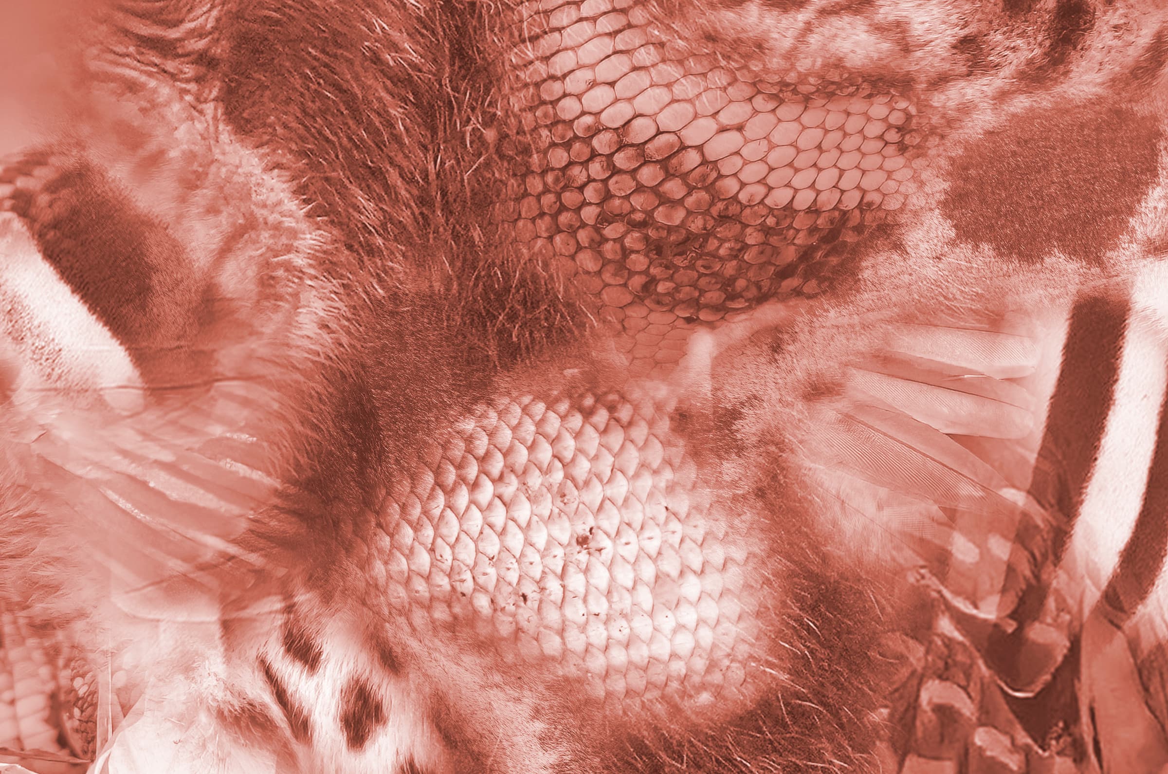
Cover image:
Collage by Nóra Békés based on Photos by Giles Laurent